


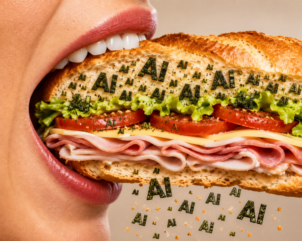


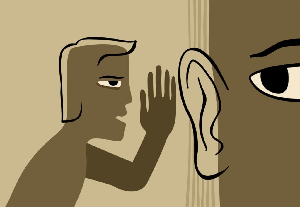


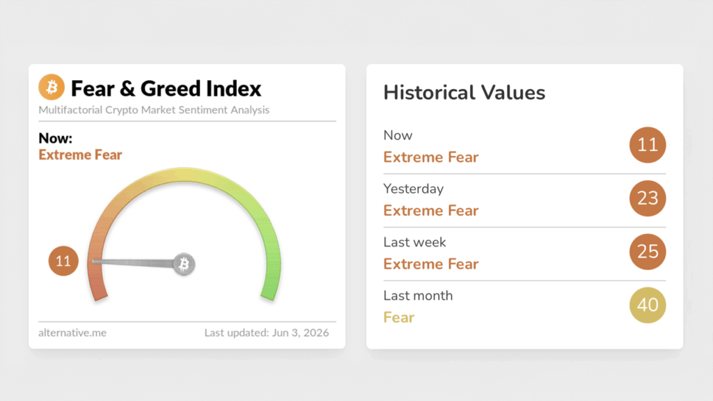


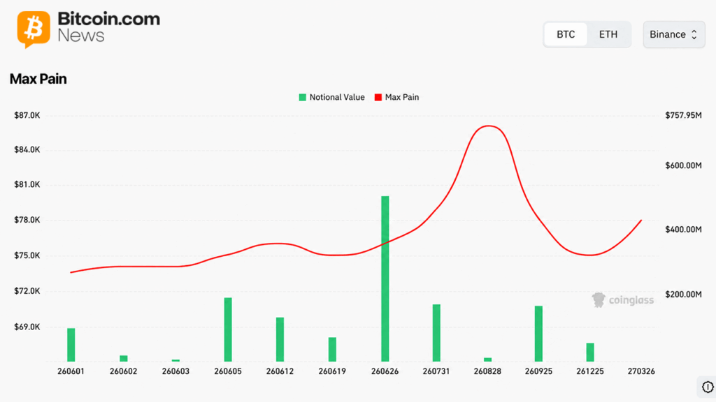


AI Has Come for Serif Fonts
As public backlash to the seeming omnipresence of artificial intelligence intensifies, the collective quest to weed out—and reject—telltale signs of its use continues.
One of the first casualties, to my dismay, was em dashes—which are a great, and very human form of punctuation, by the way! There’s also the “rule of threes,” which is meant to scan as rhythmic, but often comes across predictable, hackish, and stale. And, of course, there are the clunky grammatical constructions of the “not X, but Y” variety.
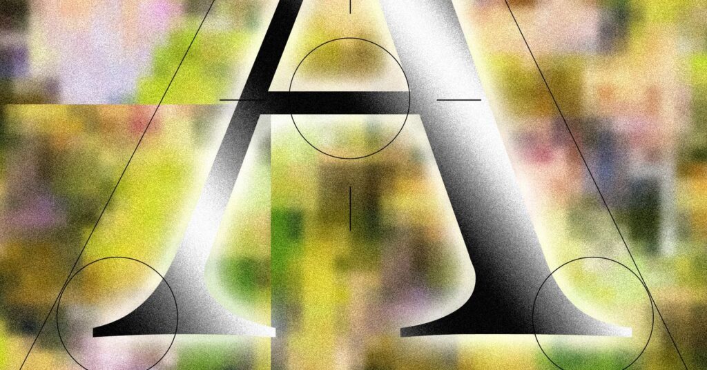
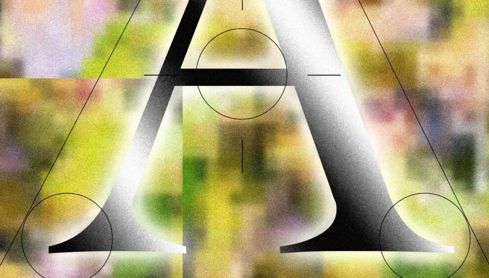
Now certain fonts and typefaces—specifically serifs—seem to be defining (and giving away) AI, both in actual software, and in vibe-coded design boilerplates. Some are calling it “tasteslop,” the results of the effort to make generative AI designs seem superficially sophisticated or distinguished.
The shift away from slicker, more conspicuously computerized typefaces is something the San Francisco Bay Area writer, designer, and type practitioner Keya Vadgama has termed “the serif renaissance.” In a recent newsletter, published on her Substack, Vadgama suggests the move is a bid for companies to project more “personality and warmth.”
“It’s not that difficult to discern why AI-native companies in particular are being drawn to serif fonts: AI is inherently cold and without opinion,” she writes. “[Using serifs] signals ‘We’re AI! But real humans use (and made) our product! We swear!’”
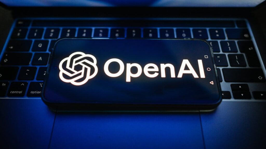
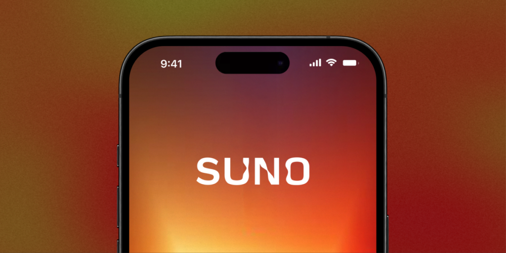
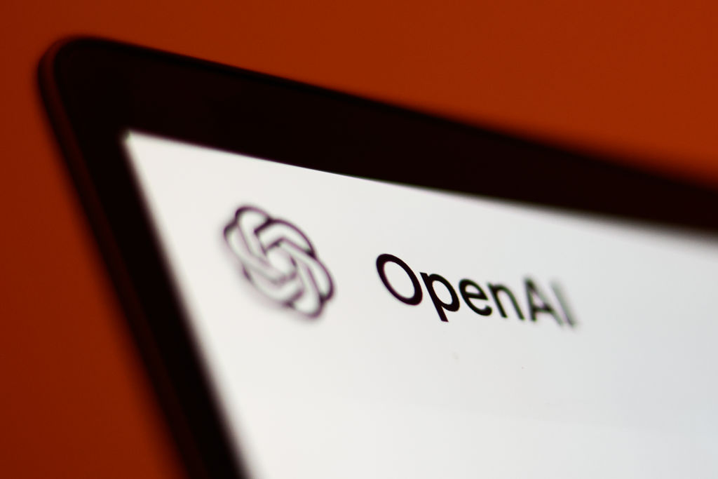
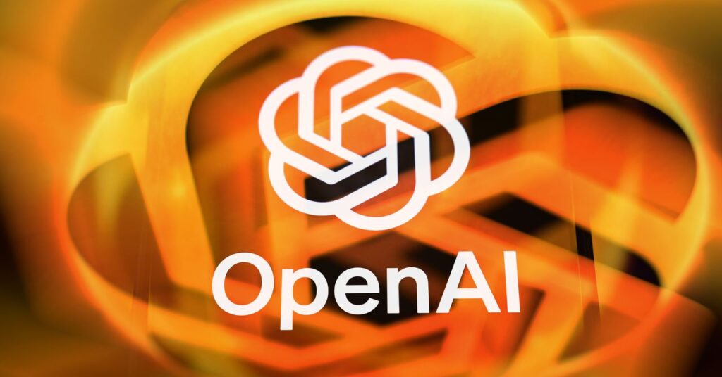
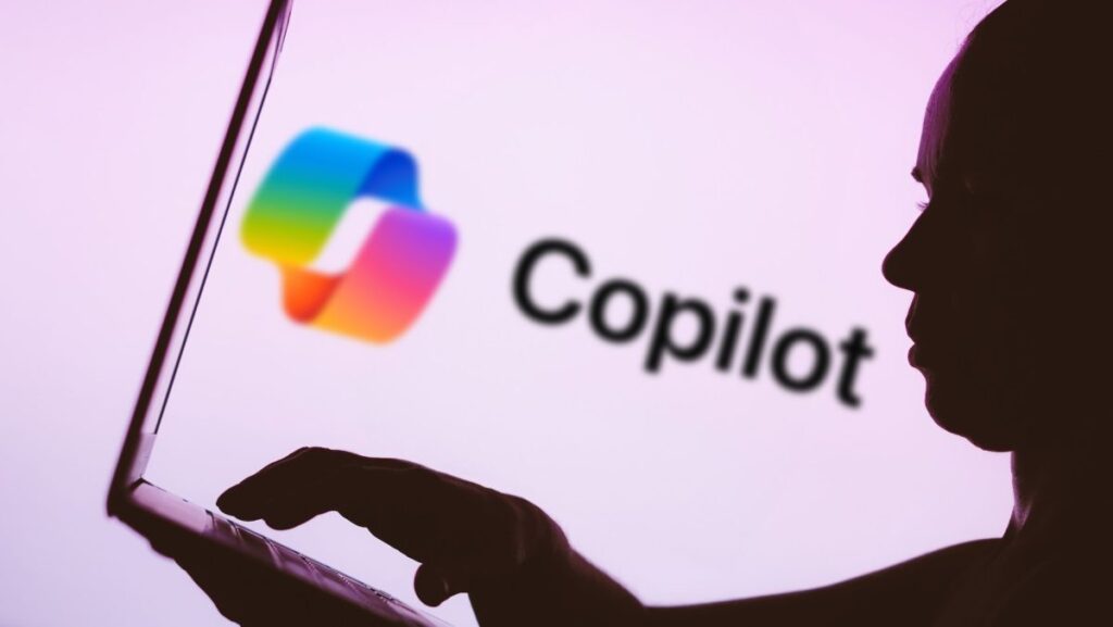
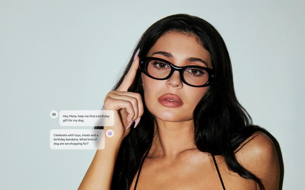
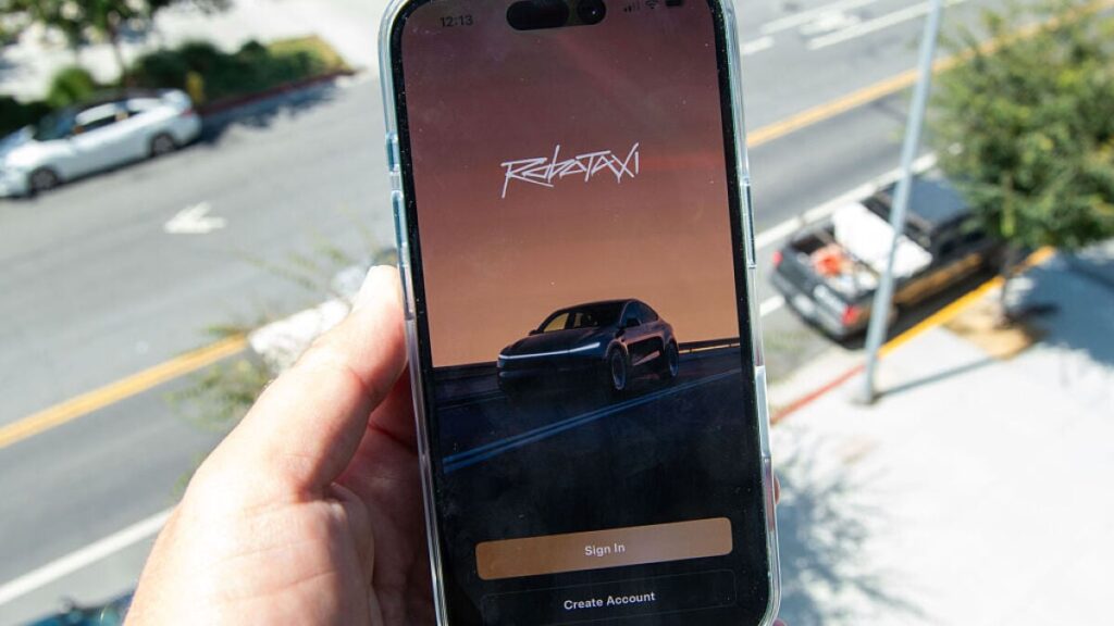
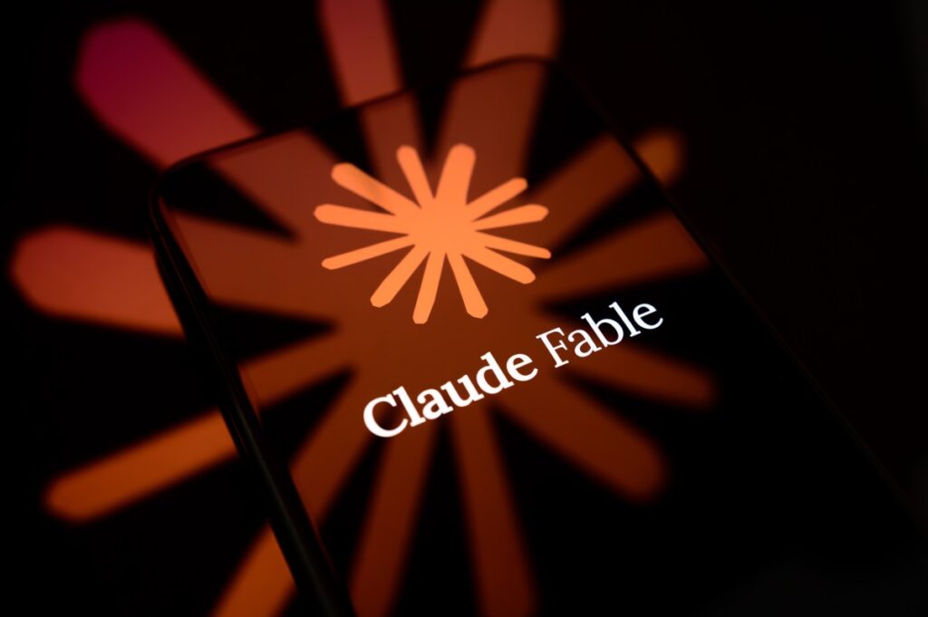
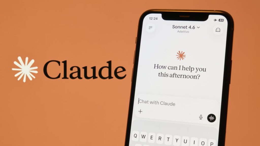
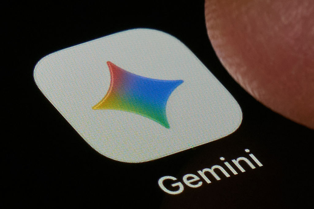
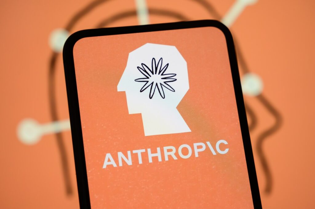
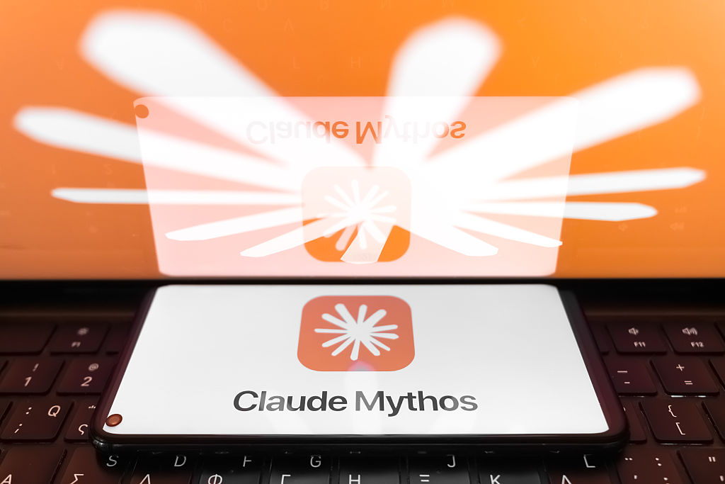
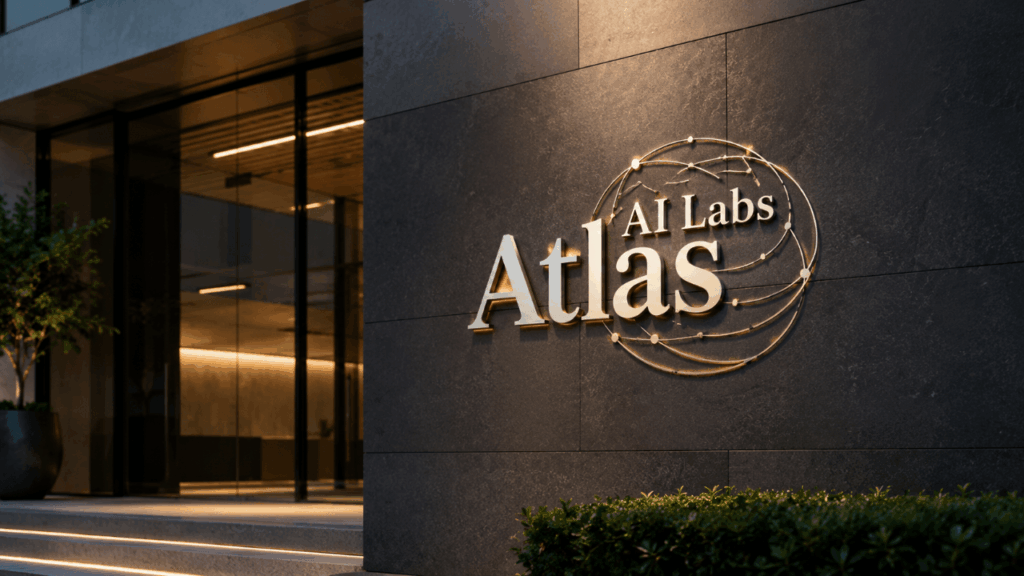
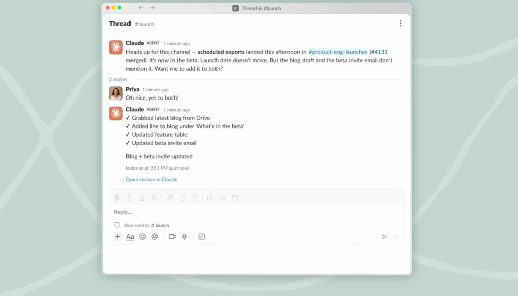
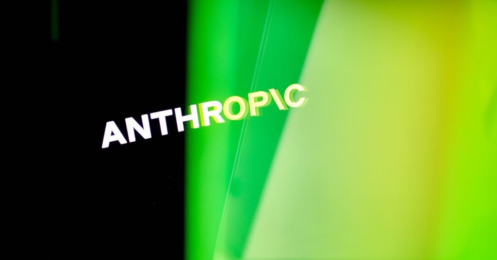
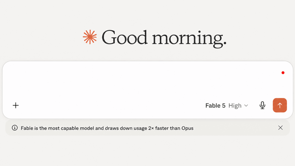
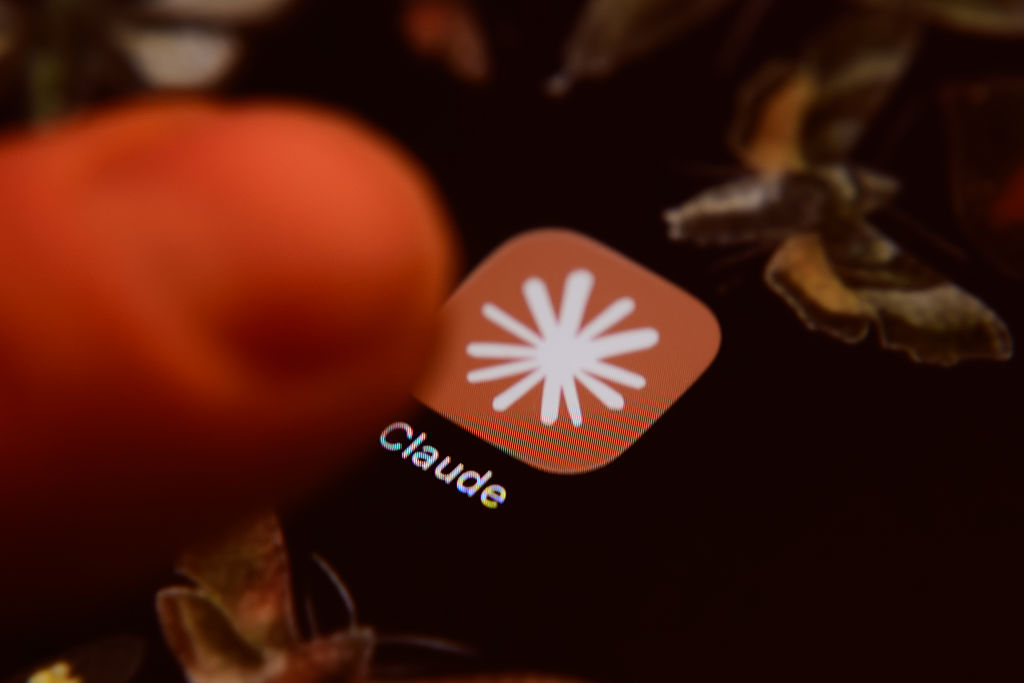
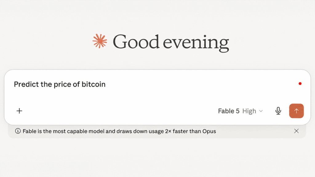
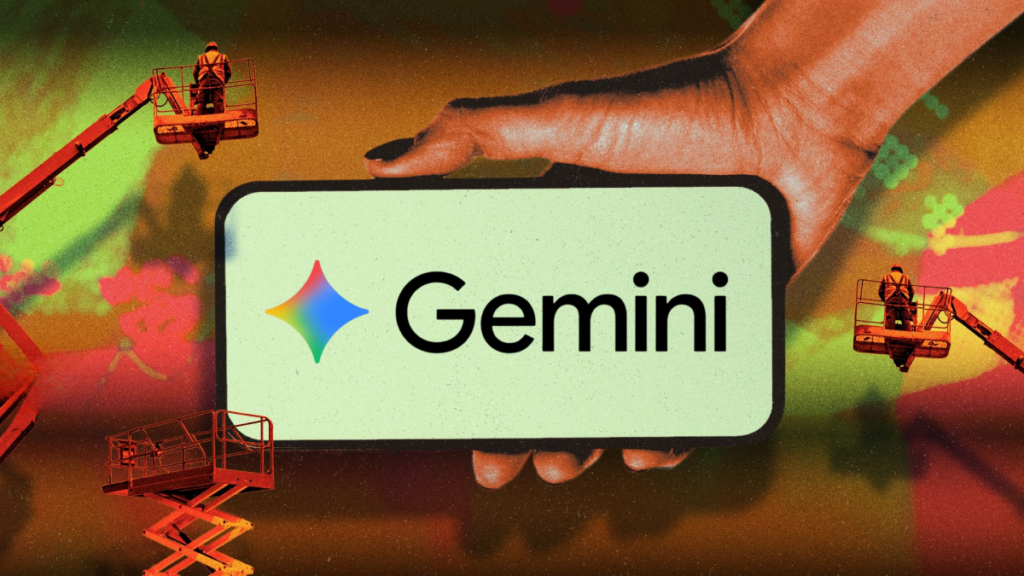
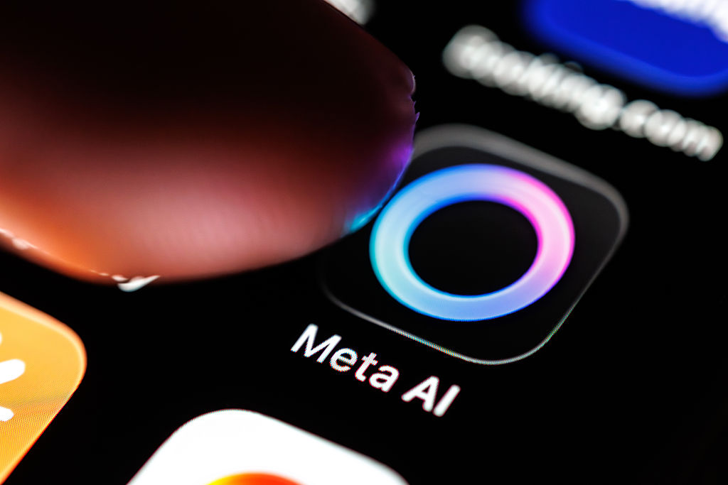
“Serifs have an origin in calligraphy,” Vadgama tells WIRED. “It connotes a very human, fluid way of making letterforms.” Vadgama has noticed that Anthropic’s Claude was defaulting to serifs. Other AI companies—Runway, Perplexity, Manus—had also adopted similar typefaces in their UX and branding.
Reached for comment, Perplexity chief communications officer Jesse Dwyer tells WIRED: “Why wouldn’t we have human design? Perplexity is for people.”
Vadgama believes the use of serifs is as much about aesthetics as building confidence between users and brands. Certain font choices signal, even at some preconscious psychological level, trust. Sans serifs (your Arials, Calibiris, Helviticas) are too clean, too computer-y. Good old Times New Roman, and similar typographic designs, can feel a bit more dignified. Recently, Vadgama was doing some branding work with a (since-shuttered) AI startup, which favored the serif text. “A big part of it,” she says, “is, ‘How do we position ourselves in a way that people are not afraid of us?’”
Serifs can help build that conviction, or at least the illusion of it. Times New Roman itself was commissioned in the 1930s by Britain’s Times newspaper. The typeface carries a certain authoritative heft. Books and newspapers are printed using it. It was all but standardized in the decades before screen reading. Perhaps most famously, the Encyclopedia Brittanica—arguably the authoritative compendium of human knowledge, at least pre-World Wide Web—was set in Times.
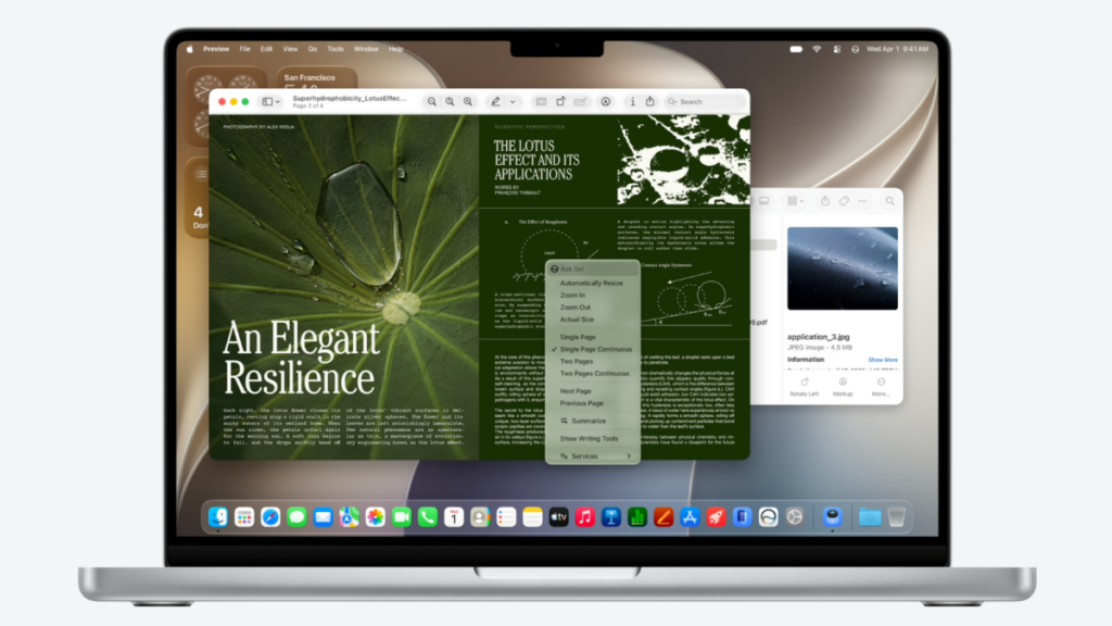
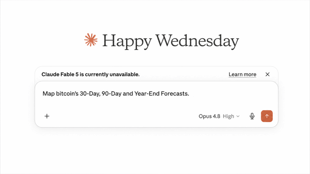
“In the broad public, a serif carries connotations of scholarship,” says Ali S. Qadeer, chair of graphic design at the Ontario College of Art and Design in Toronto. “Claude is interesting. It’s using this slightly brown background to mirror a book page. It’s sort of emulating the feeling of reading print. And print has deeper associations with trust.”
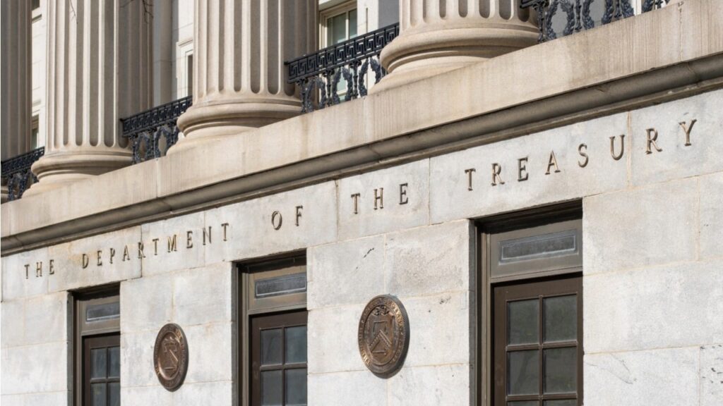
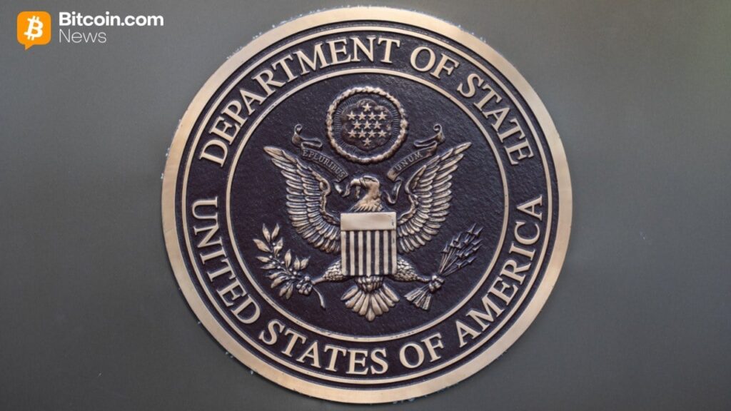
As reported by The New York Times, even the US State Department has returned to using Times New Roman after Secretary of State Marco Rubio decried Calibri as “informal,” pegging the department’s adoption of the sans serif typeface on some wider, Biden-era DEI initiative.
Both Qadeer and Vadgama see the trend toward serifs as a rejoinder to AI’s perceived (and, indeed, literal) lack of soul, and the wider public suspicion of the technology. They’re not the only ones. Alongside the “tasteslop” discourse, people online have criticized the serification of AI aesthetics as “generic” and “very ugly.”